What drives me crazy?
In every workshop I run, I start with this question: What’s the one thing that drives me crazy in CRO (conversion rate optimization) work?
I usually get great answers, but almost never my answer.
And here it is: quitting after one iteration.
Think about it.
You had an idea, built a hypothesis, and added it to the roadmap.
Your designers worked hard to bring it to life.
Your dev team built it.
QA tested it.
You launched the experiment… and then it lost.
And what happens? You stop. You throw the whole thing away.
That’s what drives me nuts.
Testing is built on losing first.
The point is to learn from every loss and refine the idea until you either win or truly prove the hypothesis wrong.
In short: you’re supposed to lose the first test, and then start iterating. Not quit.
And the good news: research backs this up. A joint study by LinkedIn and Harvard showed that running multiple iterations of experiments led to a 20% lift in key metrics compared to single-shot tests.
Iteration works.
If “move forward” is the mindset you need to win an A/B test, iteration is the muscle.
In this guide, I’ll share the foundation of A/B testing iteration, based on the scars, bruises, and lessons I’ve gained from hundreds of failed tests and cycles of iteration.
I’ll share practical tips and real-world examples that show how small, smart adjustments can lead to significant breakthroughs.
Let’s get practical:
1. Prepare your next hypothesis in advance
Every test you design forces you to make tough calls between design, copy, placement, and more.
My tip: before you launch, take the hardest decision you had to make, assume it failed, and prepare the alternative version as your next iteration.
Real-life example: short vs. long LPs
Many marketers default to long, never-ending landing pages.
But when intent is high, short can win.
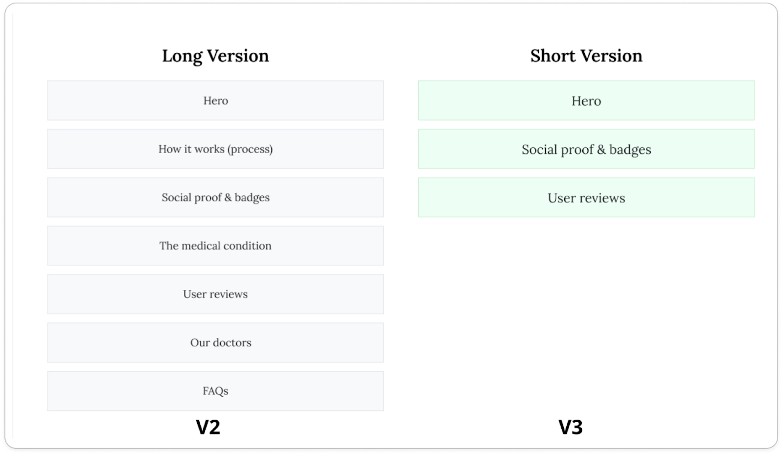
I learned my lesson after launching this endless landing page for a prescription medicine.
“It’s the customer’s health,” everyone said. “We must give them all the information and trust.”
Guess what? It crashed hard on Google paid traffic.
My immediate next iteration was a simple 3-section version.
It beat control by +16%.
Since then, I always try to prepare both versions in advance.
2. Watch Users Meet Your Variant
The first time you see users interact with your test variant is always different from what you imagined. It’s crucial to watch how they actually behave: scroll, click, bounce, convert.
My tip: Follow the “First 3 days” routine. Dedicate time on the first three days of every test to watch closely session recordings and review heatmaps for both variants. You’ll often uncover golden insights for your future iterations.
Real-life example: The 3 vs. 6 fields registration form
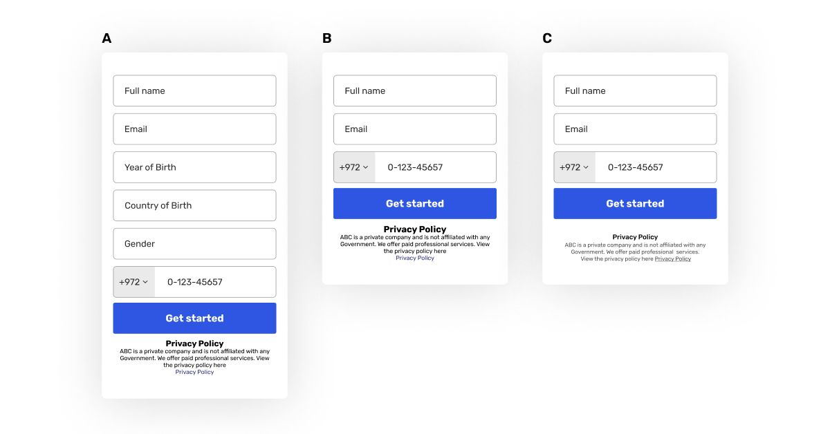
We ran this test on a mobile funnel for African users, comparing a 3-field registration form to a 6-field version, expecting the shorter form to win easily.
Instead, the registration rate dropped by 14%.
Watching session recordings revealed why: on the short form, the privacy policy jumped straight into users’ faces, creating hesitation. In the longer form, they started filling before even noticing it, as it was below the first scroll.
We iterated fast, enlarged spacing, and minimized the text. Within days, registration improved by 20.5%, outperforming the control. Sometimes, session recordings show what data can’t.
3. Use Cheap Builds First
When losing is the most probable outcome, your goal is to invest as little as possible in the first iteration.
My tip: Always look for manual, simple, and low-cost solutions that can indicate whether your hypothesis actually works before committing to development.
Real-life example: The updated comparison list test
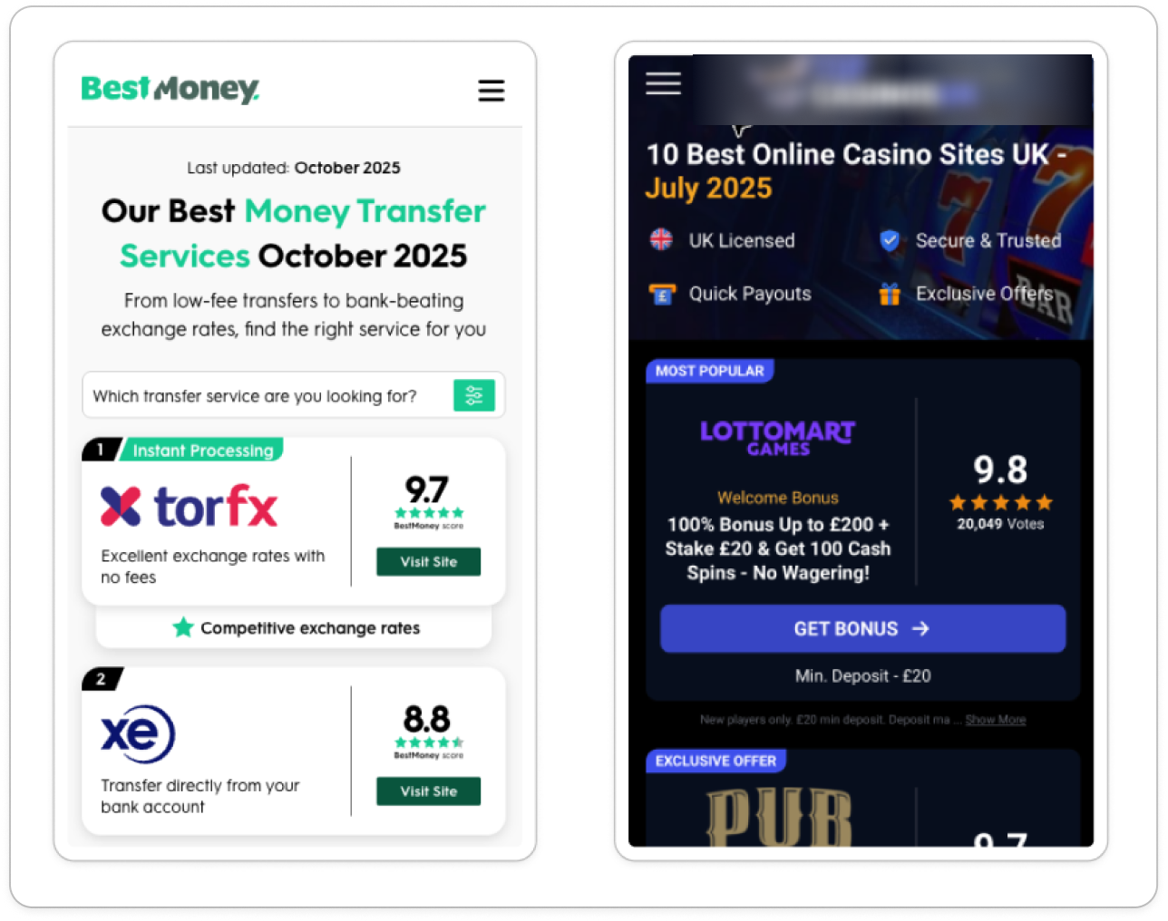
We hypothesized that adding the month and year to the headline of a “Top 10” comparison page would increase relevancy and therefore conversions.
Instead of building an automated system to update the date each month, we tested it manually by adding the date as static text.
The test won big. Only then did we develop the automation. Later, we iterated again, improving the date color contrast after seeing it perform better.
4. Test the Execution, Not Just the Idea
A good hypothesis can easily fail due to execution. Don’t kill the idea too early.
My tip: Try a different angle, format, or delivery before giving up.
Real-life example: The Dark Mode Test
One of the companies I work with runs a major Top 10 streaming comparison site.
The team had a strong hypothesis: use a dark-mode layout like Netflix and Hulu to create familiarity and continuity.
They built a dark version, launched it, and it failed hard.
So they killed the idea.
Two months later, I started working with them, and they asked me to take a look. After a quick review, the problem was clear to me:
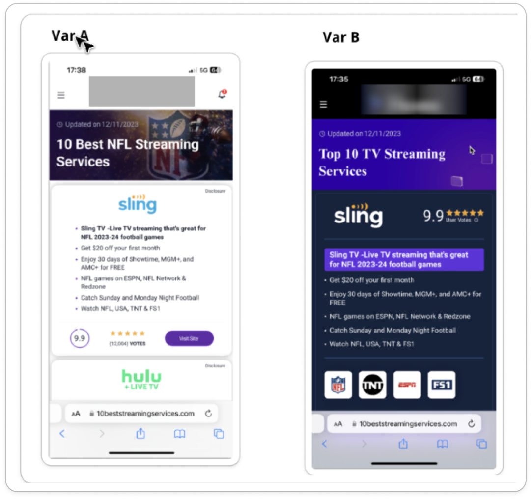
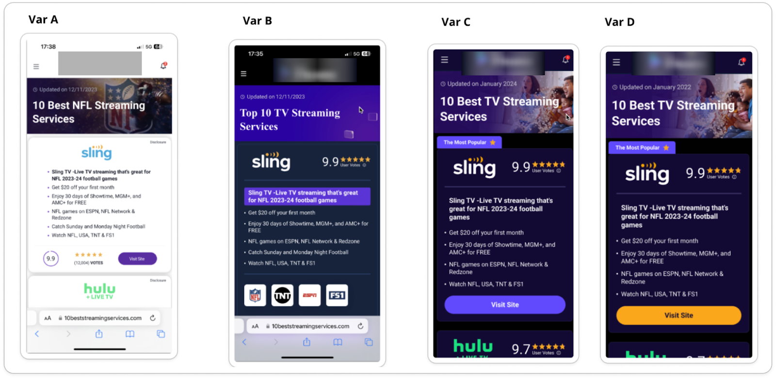
So we took the defibrillator and brought the idea back to life. We iterated.
5. Split the Hypothesis when multiple changes failed
Many losing tests include more than one change. So when the test fails, you don’t actually know what caused the drop.
My tip: When a test fails, try removing one change and test again.
Look for micro-signals (scrolls, clicks, hovers) or data insights across the funnel.
Real-life example: The “Discreet Medicine” landing page
One of my favorite stories comes from a landing page for a prescription mental health medication.
We redesigned almost everything on the page after deep research, and expected a dramatic improvement. Instead, performance dropped by more than 20%.
We didn’t give up.
We iterated through multiple versions to isolate what was holding users back.
The breakthrough came from one core insight: patients deeply value discretion.
Originally, the hero image showed the actual pill bottle.
We replaced it with a plain, unbranded shipping box that looked private and unrecognizable.
That single change led to a dramatic +13% lift in conversion rate.
One deep user insight.
One iteration.
Massive impact.
6. Iterate on Winners Too
Some teams stop once they see a green result.
But right after you win is actually great timing to improve. You have momentum, data, and confidence.
My tip: When you win, don’t stop. Jump right into another iteration.
Real-life example: Dark mode was only the start
Remember the streaming Top 10 story? The dark mode iteration gave us a +17% lift in conversion rate.
But we didn’t go celebrate. We doubled down.
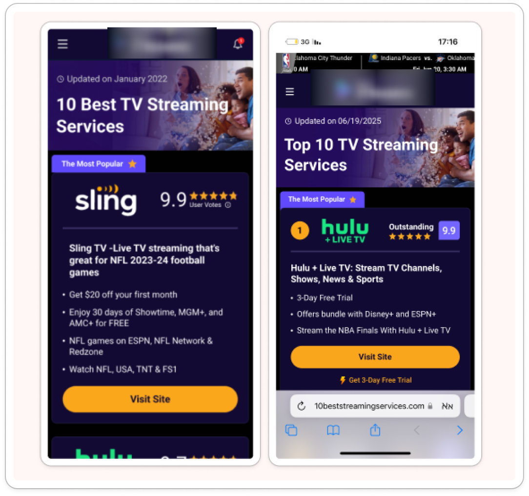
Over the next 15 months, we ran 6 more winning iterations (and many losing ones) on top of that version.
See if you can spot some of them in the image below.
Testing is not about finding the perfect idea.
It’s about getting better until you win.
Be ready to lose.
Be ready to move forward.
Be ready to iterate.
That’s how you win.